AKmarket40
E-commerce site rebuilt from scratch in 4 months, with an interactive product comparison block featuring a slider and drag-and-drop reordering; traffic and time on site grew by about 20%.
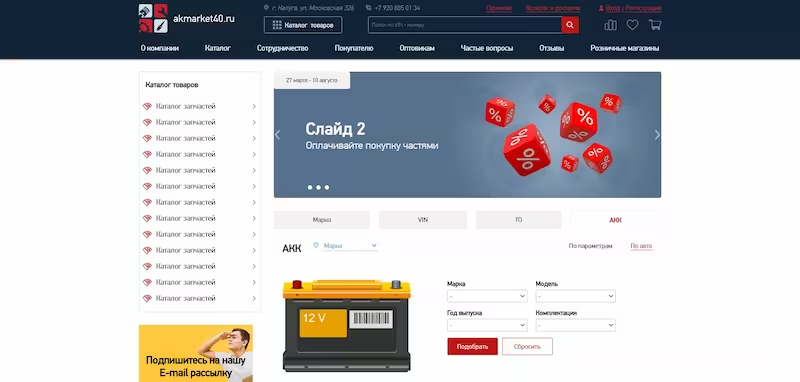
About the project
A full redesign of an online store, from the storefront to the admin panel, built from ready UI/UX mockups at Oweb Solutions. I handled the whole frontend and worked with a project manager, backend developers, and a designer, helping the designer keep the logic of the old site. Work was done in weekly sprints with feature branches, pull requests, code review, and a local Docker environment.
The problem
The old store had an outdated, inconvenient interface and its customer base was not growing. The site had to be rebuilt within 4 months with new logic while preserving the features of the old one. The comparison block needed specs to line up row by row even though cells held different amounts of text.
The solution
The comparison block has a static column of specs on the left and one slider column per product, with navigation arrows appearing when there are more than three products. I proposed and built drag-and-drop reordering with jQuery UI Draggable, and the column order is preserved. Uneven row heights were solved in pure CSS based on the largest cell content, with no extra scripts. After launch, traffic and average time on site grew by about 20% according to Yandex Metrica, and the project was delivered on time.
Tech stack
Screenshots
Feedback
Tried this project or read the case study? I'd love to hear your thoughts.